November 8, 2007
Global Seminars & Invited Speaker Series
NEW VIEWS ON THE CATHEDRAL OF PAMPLONA
A façade for a cathedral
Mr. Joaquín Lorda Iñarra.
School of Architecture of the University of Navarra
The facade of the cathedral of Pamplona has a triple interest.
It is of obvious local interest: it is a nice example of the decision-making in cathedral councils, and a surprising decision in Pamplona: the idea arose in a context that did not allow such a display to be expected: most of the people involved did not quite know what was coming; however, once they began to glimpse it, they did not decide to stop it. And the facade, which had the good fortune to find an excellent builder in Ochandátegui (one of the few people in Pamplona who could understand it), was done perfectly. That is why it seems so out of place.
It is of interest from the point of view of the history of architectural taste. It is an elite façade, designed in 1783, by an older man, and therefore consciously placed (somewhat at odds) with respect to strictly contemporary architectural publications, which would absolutely change the landscape in the following 20 years. In the subsequent generation, the influx of medievalist revivals would make it even more difficult for a cultured person to appreciate it well.
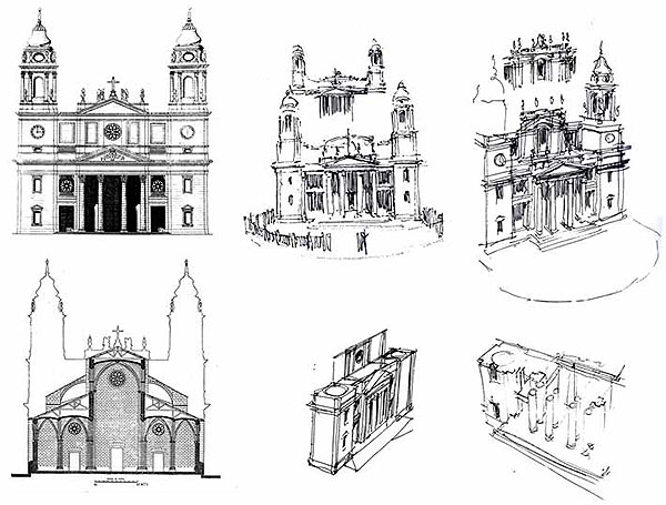
And it has a general interest: the façade of the cathedral is a lesson in almost abstract composition, hardly adapted (sufficiently) to the case of Pamplona. It is designed at a time when, although archaeological fashions advocated an essential fidelity to the poorly known examples of antiquity, European designers had at their disposal all the registers of classicism within their reach; and they tried to apply them to matters such as composing a cathedral church elevation, a large temple. And therefore it represents the virtues and limitations of that repertoire in its most obvious form. It is this application that is the subject of this lecture.

J. Lorda (on Yárnoz), Cathedral façade: achievements and problems.
To understand this façade, one must accept that it is not a problem of "style", but of experience: a matter of essay and error, which has been dealt with since the 15th century. The façade follows the traditional basic outline : central elevation corresponding to the main nave, and towers at the angles. The outline , however, presents obvious difficulties when one wants to solve coherently with orders and even more so if one wants to introduce a portico with free-standing columns. This problem would not have been such in 16th century Spain. In the 18th century, a conscious designer knew that it was not enough to accumulate small elements on top of each other. Therefore, this design is one of a long list of examples, rarely built, that presides over San Pietro del Vaticano: it tries to coordinate a wide horizontal development with the traditional silhouette of the bell towers.
After the early Renaissance contributions from central Italy, the theoretical designs of large churches had had a particular development in France, since the late seventeenth century, with the (very French) precedent of Saint Paul Cathedral in London. And in fact, much of the ideas that Ventura Rodriguez employed are French. He also took advantage of the contributions of English neo-Palladianism in the mass compositions.
Ventura Rodríguez had to face this problem several times throughout his degree program; although in no case would these great projects be realized. At each moment he made use of the resources available to him. And, almost at the end of his life, the enormous number of references he used in his design for Pamplona is astonishing; bearing in mind that he had to combine them under the pressure of what today we would call "neoclassical" architecture, which demanded at least a declaration of simplicity.
It is the facade for a large church, without concessions of trifles, but with many formulas of international classicism (mainly French). They are evident in the general composition and in the details. Among these, the portico stands out, which follows exactly the proportions of Vitruvius, the Roman treatise writer; but it is reinforced by duplicating each column, to achieve greater depth accentuated by the shadow. The example of Pamplona is almost unique in this feature. Precisely because of its dimensions and the technical difficulties involved in a large free-standing colonnade, this type of facade rarely became a reality. Many other successful schemes should be added, such as loggias on intermediate axes, and towers with recessed corners; even bell towers with belfries at the top (a tribute to Saint Paul).
Compared to Rodriguez's previous facades, the Pamplona facade is simpler, but curiously richer. It is also noticeable that Rodriguez, in deciding on some options, lost others that were well resolved. The powerful towers seem to ask for a more important element in the crown of the facade. Overall it is an excellent lesson in architectural composition at the end of the 18th century, and deserves to be better known.
