The piece of the month of March 2019
TWO MONUMENTAL PIECES OF ARCHITECTURE
Juan Carlos Valerio Martínez de Muniáin
Doctor of Architecture
I would like to compare, in this Piece of the Month, two buildings that seem to me to be masterly monuments of modern Pamplona architecture and that express very similar concepts: one is the old Caja de Ahorros Municipal de Pamplona by Xavier Sánchez de Muniáin, Fernando San Martín and Roberto Urtasun, from 1975, and the other the Library Services of the University of Navarra by Javier Carvajal, from 1998.
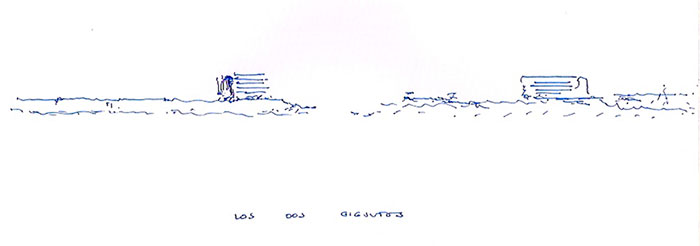
Both are "Renaissance" pieces of architecture. Both evoke an ideal of classicism, both look out defiantly at the exterior landscape, both are essentially cubic or express the ideal of the Renaissance cube. Both possess an element of transition with the ground plane, one with concavity, the other creating a lower reception building; both, so as not to appear overly inhuman or abstract, possess an element of anchorage to the earth, a vertical element containing the stairs and elevators. In final, both evoke an ideal of tower-cube, of renaissance longing that contemplates the landscape, and have a pretension of eternity in their material, exposed concrete, in their pretension of a single material, and both pretend to be monumental landmarks of their city but evoking a different, dreamed city.
Let's start with the first one. It has always seemed to me the most masterful building that the 20th century has left in Navarre and not only in Navarre. In Spain, in spite of its extraordinary architecture during this century, there is no building of such category, and I have not seen anything similar either in Italy, France, England or Germany. Probably in America, both Hispanic and North American, there are buildings that come close to such perfection. I consider it, therefore, and without any exaggeration subject , one of the jewels of European architecture.
The building is located on the line of the Renaissance wall of Pamplona and takes that attitude of limit tower and defense of the old city. It becomes in turn the tower of the Citadel, the ideal Renaissance city, with which it dialogues very well as both are made of a single material but of different tones; as one is horizontal and the other a succession of powerful horizontal planes; and because of the austere, violent and military attitude of both. Both, in their tones, seem to seek an ancient and modern camouflage.
At the same time, our building sought in its proportions and silhouette to achieve a sense of grand scale, reflecting the power of the institution that promoted it, and with a modern and challenging architecture that tripled the scale and height of the Ensanche.

From the first moment he takes the attitude of not sticking to the marked alignments, but to raise a perfect cube where only the vertical element of access hints at an adaptation to the limits of the site.
The building creates, in its meeting with the earth and looking outward to the city, a monumental porch and a three-height glass piece as a transition between the upper cube, the real building, and the city. This glass piece dialogues with the smaller scale of the Ensanche and lets the upper cube ascend freely towards the top.
This transitional building expresses many ideas in relation to the tall building, it has a curtain wall insinuating transparency and at the same time a certain weakness, it is protected by the upper cube, and its mission statement is to receive the city. Therefore, in its interior it has that marvel of the half levels that ascend in spiral, achieving an extraordinary continuity and sense of unity. It becomes all of it as a entrance hall of the city, a great reception. It is also significant that the upper building is riddled with chiaroscuro and shadows, and is made of hard, violent exposed concrete, while this one is made of specular glass like a jewel. I think he is hinting that the curtain wall is weak to face the exterior landscape and will give way to a new, stronger, more structural architecture. It is a hint that the era of the curtain wall had passed and was giving way to a firmer era.
The upper building astonishes for being a cube defined by horizontal planes where the structure, pillars, slabs, and facade elements, parapets, walls, lattices, are all made of the same and unique material, a wonderful concrete perfectly executed. In that sense it returns to the old architecture, overcoming the nineteenth and twentieth centuries, which played so much with different materials. It is undoubtedly reminiscent of the cathedral, also made with a single material, but replacing its vertical structural elements with horizontal elements.
The succession of horizontal shots with deep shadows, leaving the glass behind, produces the sensation of scanning the landscape with extraordinary force and violence, and at the same time achieves a dreamy look, not so much hopeful but anchored in reality but evoking a different city, perhaps more Mediterranean, more American, of a luminous, open and distant landscape.
Inside, the open gaze is directed in all directions and the sensation of space trapped by the horizontal planes that float and look out over the landscape is undoubtedly the sensation of Renaissance space that the Renaissance had to combine with the presence of the walls, but which now in the 20th century the structure freed from the wall has made it possible to achieve in its fullness.
This impressive Issue has the "mannerist" detail of the concrete lattices that act as a parapet, they graduate the look and move us away from a Calvinist rationalism, they give it warmth, the dream, the human scale. They, in the baroque shadows they produce, are equivalent to our baroque balcony bars, to our Arab lattices, to the flowers on our balconies that try to create a filter to protect our intimacy.
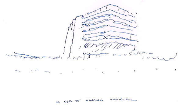
The vision of that great cube in succession of levels with the lattices speaks to us of a unique piece, and I do not know why it does not speak to me of a European building, but of a building of an Arab country or of Hispanic America, perhaps because in those countries those models of architecture were given. It is clear that it could be a building from Iraq, Arabia, Egypt, or Mexico, Colombia, Brazil, or also from the south of the United States, since it seems to need sun and light to reveal its full intensity; it seems to be a building from warm countries rather than from fog and rain.
But the building, this magical cube, has a third surprising element. It is an attached Issue of eminently vertical character that shelters the communications. It always seemed to me a foreign element to the other, but at the same time it is understandable; without this element the cube would have seemed too proud, isolated, overbearing, living on the fringes of the city.
This vertical element anchors the city, gives it the precise vertical contrast to such violent horizontality, in a certain way makes it humble and gives it at the same time an extraordinary complexity and richness. And all this despite the fact that it always gives the impression that it weighs too much on the great cube, that it is going to break, that the cube would like to be free.
It is clear that the large cube could have had the communications inside it, but by taking them outside it can be left free with a magnificent diaphanous floor plan. However, I think the real motive was expressiveness, to create the vertical-horizontal contrast, and they accentuated it, because if the cube is perfect in its limits, the vertical element is broken, in a way it is the one that adapts to the city.
We have seen in many Romanesque and Gothic buildings that need; when they had managed to fly in their towers or cimborries, they counterbalance themselves with a massive Issue to avoid dreaming excessively, as if showing that they knew where they were, that they needed that weight, that ballast to avoid being excessively idealistic. It is like a ship, which without the anchor would spin continuously. Our building, without that element, would have begun to turn, to feel in the end in the hands of the landscape, helpless. It needed that contradiction to avoid turning, no doubt.
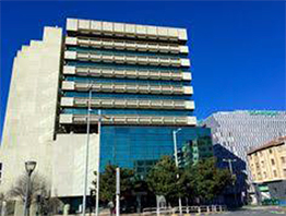
At final, it is an architectural masterpiece. For me it is comparable to the Cathedral, to the Citadel, that is to say, to the great masterpieces of Spanish and European architecture that Pamplona provides. To contemplate it is a joy for the spirit; it speaks of a powerful, cosmopolitan, large-scale, strong and delicate, violent and dreamy city.
The second building, which I believe has much to do with this one in its approach, but built years later, when that strong and dreamy optimism had already been left behind in our country, is the Library Services by Javier Carvajal. If the first was a tower of a Renaissance city, almost a tower of its Citadel, this one, on the other hand, is a tower in an urbanization outside the city and formed by isolated buildings where the park, nature, gives them unity.
The University of Navarra was born as a Roman villa on the outskirts of the city. Thus its first building, the Central Building, is just that, it is a Roman villa, a palace, with its courtyard, its towers, and its place which is open to the south. The whole University has grown following this model; horizontal buildings contemplating the park, without pretensions of standing out, leaving to the towers of the Central the work of defense and silhouette.
Thus a magnificent university city was formed, showing a modern ideal city where everything is dominated by nature and the buildings follow secret rules, intuitive, dialoguing with each other. All are parallel, horizontal, they look across the green, only the residential towers will break that dynamic but for that reason, for being residential, showing again the ideal of that city of the Modern Movement. The criterion had been maintained until the construction of the Library.
Carvajal proposes from the beginning a building with a cubic spirit, a tower-cube that dominates, that stands out from all the buildings of Campus. It is really a rectangular prism, but the sensation is undoubtedly of a cubic Issue . Like the first building, it is all of one material, exposed concrete, with the glass so far back that it barely influences; and like it it looks out over the landscape, like it it is strong, violent in its presence and expression, but how different in its gaze! If the first one looked out over the landscape as if dominating the world, in this one his gaze is restrained and of infinite sadness.
The horizontals of the floor slabs are no longer marked, nor is their look shaded by the lattices that mark the warm and human scale. Here the perfect cube, the facade, which is really a mask because the building is behind it, separated from it, has dominated all horizontality, all dreamy expressiveness.
I had known the evolution of this architect's architecture and seeing his youthful porticoes at the University of Barcelona (light, Mediterranean, luminous, optimistic), and seeing this last portico, so dense that it is really a perforated wall, reminds me exactly of the evolution from Brunelleschi's naive and delicate column to Michelangelo's tragic and gigantic pilaster. It is exactly the same evolution, but if in the Renaissance it took a hundred years, in the twentieth century fifty years have been enough.
From the interior the person does not dominate the landscape in all directions as in the first building, here the walls frame the landscape, which appears as a painting, distant. The landscape, nature, is thus contemplated from the darkness of the interior protected by the walls, and thus appears distant, hostile. In contrast to the dominance of the landscape of the first building, here the landscape is another world, its vision from the deep hollow induces meditation, prayer, contemplation of the landscape as a mystery. That is why the interior spirit of this building is undoubtedly medieval.
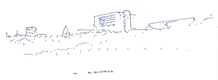
What this building expresses is an infinite sadness and desolation. It is a fortress, it undoubtedly rises, it dominates the Campus; it is one of the towers of the Central but enlarged in its scale, recreated. It undoubtedly intends to stand as a defense tower for the humble and horizontal buildings of Campus. It defends this city, it will shelter knowledge, it is like the towers that arose in the Roman villas at the end of the empire in the face of barbarian waves.
I think the building is really that, it is a tower from the end of the empire. If the first building was a tower, a cube of Trajan, this is a tower of framework Aurelius.
The depth of the glass in the darkness of the holes gives them that deep look of sadness. The enormous thickness of its walls tells us of a time of danger, of hardness, where we will have to resist very difficult times. The square of its holes makes reference letter to the whole building, a building that is but a single square hole, very Spanish, but repeated as in the Escorial in a disciplined plot ordered, infinite.
In contrast to the Renaissance, which sought the corner gap, here the corners are reinforced, something that was already hinted at in the first building when the lattice died before reaching the corner that showed the concrete in all its silence.
Like the first building, this one culminates its facade with a large smooth and solid section. This gives it a strong front that weighs on the floors, which sample is ready to defend; it is a front, if I may say so, "manly", as in the other building.
If the other building floated in space and looked out over the landscape, this one seems to weigh, but it also floats in a more subtle way as its hollows blend into the ground without a base, as the first building really had, even in glass. The unpreparedness of its floor plan leave, seen on its north side, expresses this disregard for reality. The building does not need to defend itself, all of it is already a defense, this is a step of extreme violence, the building does not dialogue with the ground plane, it emerges from it without transition, it is typical of Doric, revolutionary neoclassicism, when the columns eliminate the base and emerge violently from the ground.
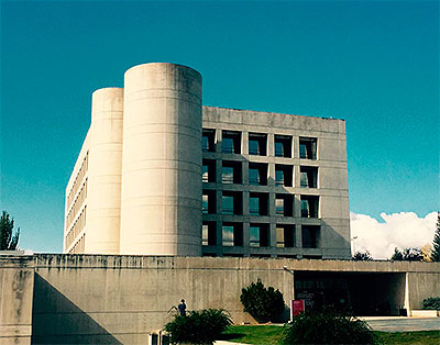
If the first building created a porch of entrance and a glass cube at intermediate levels that spiraled upwards, this one only advances a low Issue , without tension. We who have known how this great architect played with light, with courtyards, see here nothing but a manifest disregard for function. The building advances this low body to receive, but it does not interest him at all, it only serves to allow the large cube to escape from the axis of the old Library Services and look towards the Campus, looking towards the Central tower, with which it establishes a secret look diagonally.
How different attitudes, how the world has changed in those years! To the dialogue with the passerby, with the citizen who was collected and amazed, and excited, in the first building, to this hardness. Because he wants to reaffirm that the interest is inside, that architecture should no longer collect, or guide, or accompany, it is for those who are able to discover it. It is absent, permanent, eternal.
If this building speaks of anything, it is of eternity. It is a timeless building, it does not seem to want to follow any fashion, it does not pretend to impress like the first one, nor to mark a spectacular, expressionist landmark. It is all silence, solitude, but presence, and what intensity in its presence!
As in the first building, all this classical purity wanted to have an element of contradiction and it is, as in the first building, the vertical element of communication. In the first building, this element anchored the first building to the city, to reality. Here this vertical element is formed by two tall cylinders and by a bay that has been attached to the cube and breaks the rhythm of its openings.
Indeed, what in the first building was a rather powerful vertical and broken element, here has been attached to the cube, imperceptibly absorbed by it, and is grade in the isolated opening that breaks the order of the cube on the north façade. That is to say, the cube is about to merge in it all communications, but has let escape a large cylinder containing the spiral staircase that connects the entire building.
In this cylinder is all the sweetness of this great architect who was my teacher. All the sadness, the hopelessness of the great cube, of its infinite hollows of longing, is broken here. From the hard-edged cube escaped a soft, curved, marvelous cylinder. It contrasts with the great cube, gives it its shadow, I sometimes think if it is referring to the woman. If the cube is the man, rebelled against his time, against his nature, against his God, this cylinder is the woman, who is giving him her sweetness, her joy, her hope.
This cylinder is the sweetness, the sign of sweetness of this wonderful building. It fills me with joy because I know that my master showed in it that he still had hope, the sweetness of a new world on a new earth, in a new sky. That little cylinder in the sun was his hope.
