"Coronavirus charts don't show the full reality; let's teach people that their sacrifices are worth it."
An expert from the University of Navarra proposes to show how cases multiply every four days: "The goal is in reaching a speed of 1".

Francesc Pujol director de Economics, Leadership and Governance Program of the School of Economics of the University of Navarra warns the media and official sources about the importance of using graphical representations that show the positive evolution of the COVID19 as opposed to the "counter-intuitive reading" produced by some graphs that are being disseminated these days.
"The graphs tend to show a sense of defeat, however, that is not the total reality," confirms Pujol, who proposes a more intuitive graphical representation model in an analysis made on the Italian case published on his Twitter account @NewsReputation.
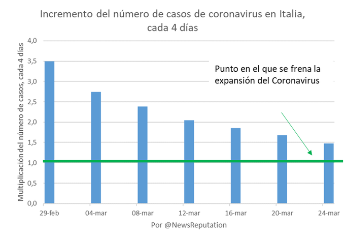
The expert's proposal consists of directly showing the rate of growth of cases and deaths. In other words, "instead of focusing on the total number of cases or new cases, let's show the evolution of how many cases are multiplying every four days," he suggests.
"These charts tell a totally different story," says the expert, "because they tell us sample where goal is and how we are approaching it. The goal is in reaching 1.0. If the 1.0 point is reached, the issue of total cases is the same as four days before: the spread of the epidemic stops. Now the virus in Italy is reproducing at 1.47; and two weeks ago at 2.05, as we can see in the following image:
In this sense, the expert stresses that the evolution of cases is a relevant clue because "we must take into account that the information given to the public has a direct impact on their individual behavior, on their acceptance of sacrifices, such as confinement, and other imposed limitations and on their psychological impact," warns Pujol.
In this way, the professor of the School of Economics stresses that the system of graphic representation that is being used mostly in the press and in official channels "can be improved if they are also shown more clearly data on the rate of growth". In this way, says Pujol, "we will show people that their sacrifices are really paying off. We can all contribute something to this, and so can those of us who produce graphic information.
The expert will try to publish every day the updated data for Spain with this graphical representation model in the following link of his Twitter account.